Blog 3: Some more notes on setup + beginning data analysis
March 10, 2025
Hi everyone, welcome back! This week, I mostly worked on analyzing data. But first, I acquired some more information about our setup which I discussed last week.
Setup part 2
Here is a diagram again for reference.
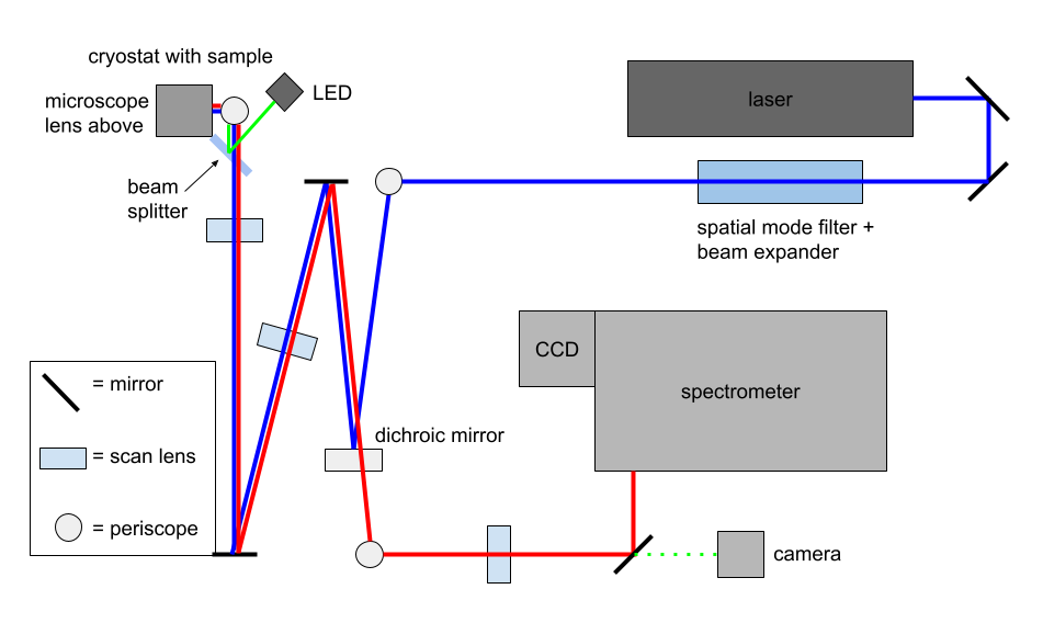
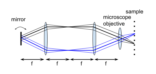
I ended with talking about the infinity optical system, but I found out there’s more to it. The mirror in between the dichroic and a scan lens is motorized. This allows the light from the laser to reach all parts of the sample, which can be seen from this diagram I made, so we can take measurements over the whole area.
Data analysis
The software I am using is Igor Pro. Transferring the photoluminescence (PL) spectroscopy data for the GaAs quantum well from the CCD camera to Igor Pro, we can get something that looks like this, where the horizontal axis is wavelength because the light was split by the diffraction grating inside the spectrometer, and the vertical axis is vertical position.
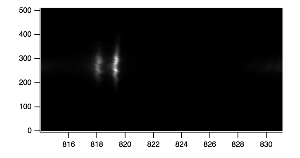
From this, I took an average of 40 rows of pixels in the middle to produce the PL spectra which looked something like this (this is at 15K).
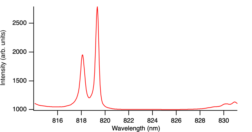
Now, the parameters we are interested in include the peak position and peak width, so we wanted a systematic way of extracting these values, which we can do by fitting a curve. My advisor first suggested Gaussian curves for each peak, but this produced a fit that was not great, not matching the peak or the shoulders.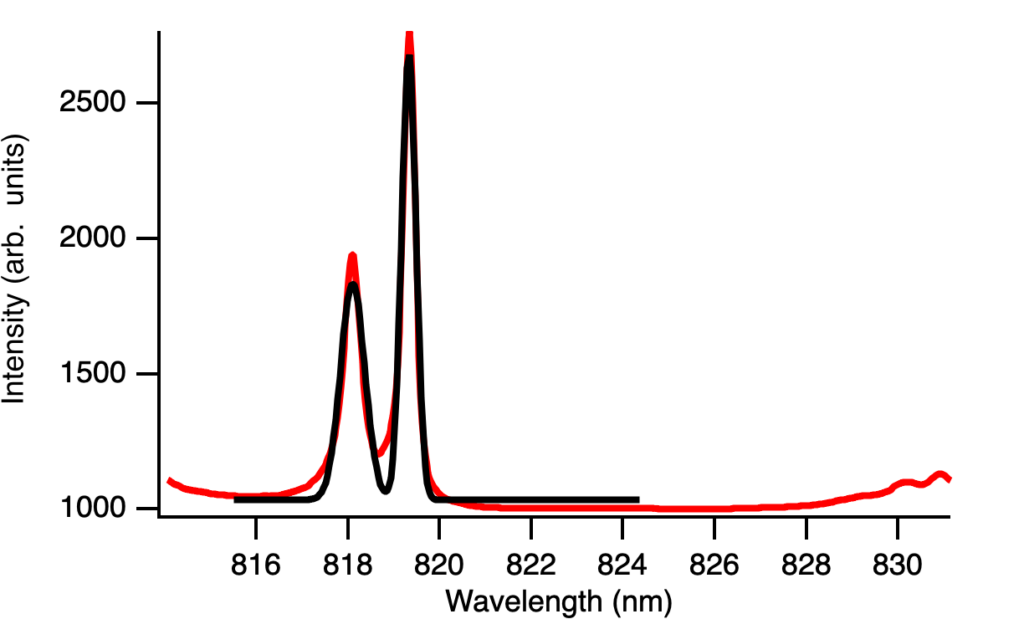
I first tried adding a linear offset which was not effective enough.
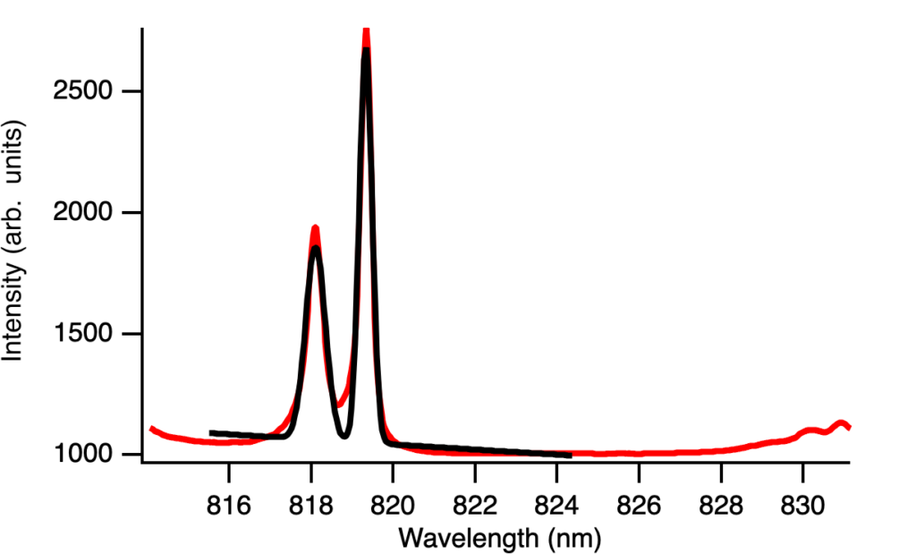
Then my advisor suggested trying other functions like the Lorentzian which looked a lot better, and adding a linear offset looked even better. This makes sense because Gaussian lineshapes tend to better capture statistical variance whereas Lorentzian lineshapes tend to better capture resonance features, which also can explain why there appears to be slightly more Gaussian shape at lower temperatures.
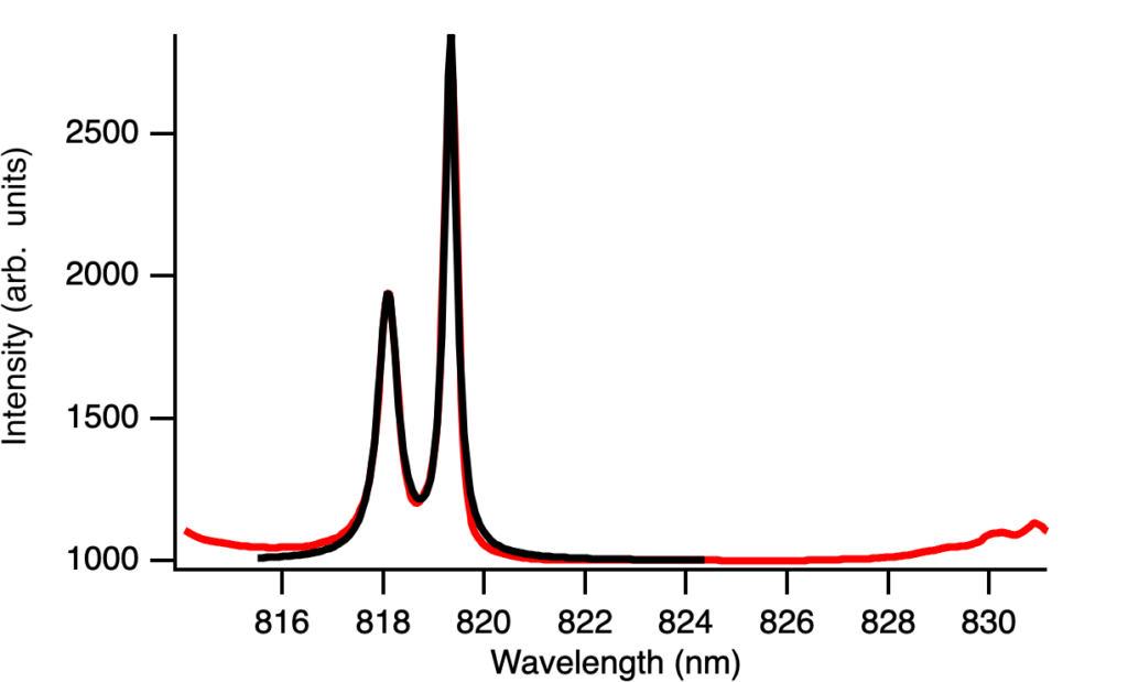
Let me now explain how this works in Igor Pro and the problems I ran into. I created the function you can see in the bottom white rectangle and you have to make pretty good guesses for each of the parameters. Otherwise, it tells you there may be no dependence or it gives you negative or nonsensical values.
After I found the best fit function, I was about to implement it to all 12 temperatures we collected data at when it kept telling me there was no dependence. I tried different guesses and my other fits but nothing was working. I asked Luke, an undergrad at SJSU, and he identified that I did not choose the right Y Data here, which I thought was automatic before.

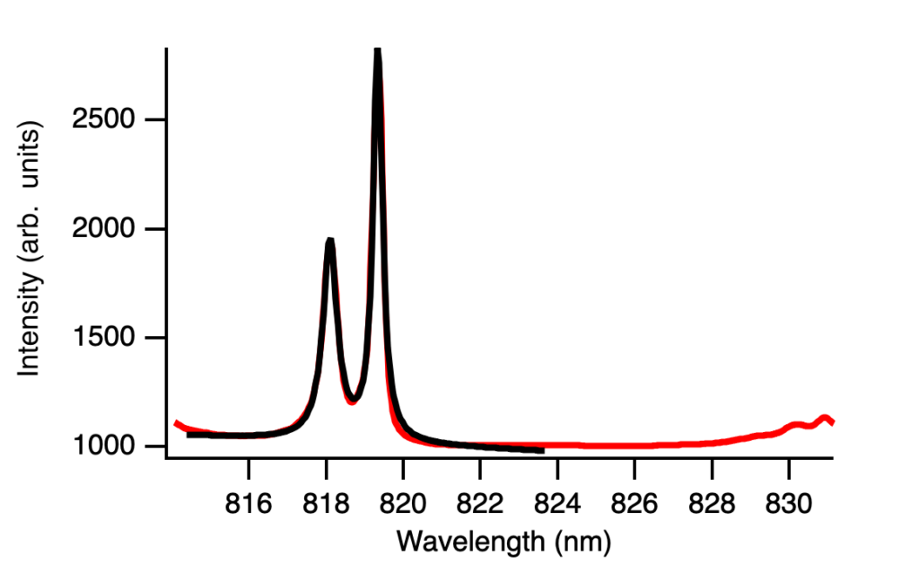
So after choosing the right data, I still made a lot of bad guesses but I got all the fits and was able to create these two graphs, where FWHM stands for full width at half maximum and I calculated to be equal to 2w for this function.
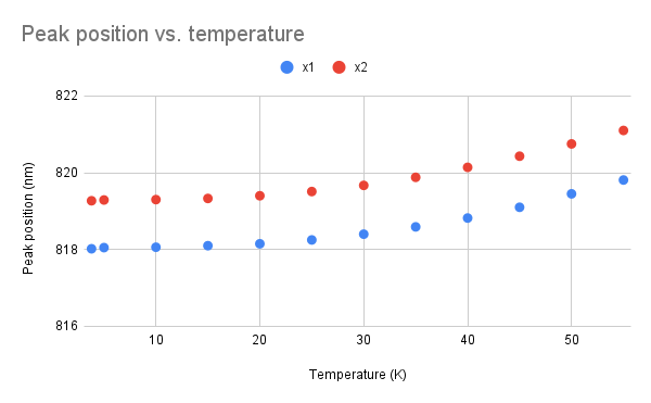
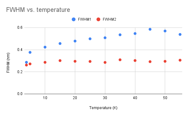
I still need to add error bars, which is where Google Sheets fails me, and it might be good to look at peak area vs. temperature, but we do see peak position increasing with temperature as expected, and it looks like only the width of one peak is affected by temperature.
Next week, I will continue with data analysis and try to read some textbooks to understand what is happening. Stay tuned!
Reader Interactions
Comments
Leave a Reply
You must be logged in to post a comment.
That seems like a good number of data points to work with! If Google Sheets fails to cover some of your desired data display capabilities, have you considered branching out to other methods like Excel?