Week 6: Finished Analysis, Initial Plot
April 8, 2026
6 weeks have been completed! 6 weeks to go.
It is officially halfway! This week, as promised, I have completed reading the interviews of the artists of the 5 works from last week. As a reminder, these are Shimeji Simulation by Tsukumizu, Otherside Picnic by Eita Mizuno, Happy Sugar Life by Tomiyaki Kagisora, Girls’ Last Tour by Tsukumizu, and How Do We Relationship? by Tamifull. I would encourage all to read these, although after reading the artist interviews, I would say that Otherside Picnic really caught my attention further. For those who want to read more, I would recommend looking at that first mainly because of how well I think it conveys exactly what the author wants.
Now that I have completed all my analyses, I have gotten to the point where I really need to think about what are the specific details I want to incorporate the most. In no particular priority, the ones I have decided on are, color contrast/shading, repetition/mirroring, and typography.
The reason I chose these is that after a lot of analysis, I realized that the details that were most striking to me were the large contrasts of negative space, dark shading/halftones, and the very different vibes. This really gave the scenes that incorporated these a sense of fragmentation and unease as well as a little bit of chaos and emotion, especially in emotionally charged moments. I also chose repetition and mirroring because, often we do not think about the smaller details in a work, but when we constantly see the same objects or symbols or motifs repeated over and over, or when we see a mirroring of similar poses or expressions, it really draws attention to them. This really caused me to consciously note these things and ultimately from the interviews the artist really wanted the reader to pick up on these things as well. Lastly, I chose typography because I noticed that some works felt very flat without variance in typography while others felt very alive and emphasized with it. Because the work is not animation, and is not voiced by voice actors, it is often really hard to convey emotions in voices and words, and typography is where that really makes a difference for manga works.
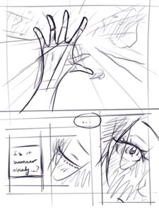
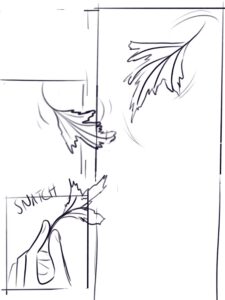
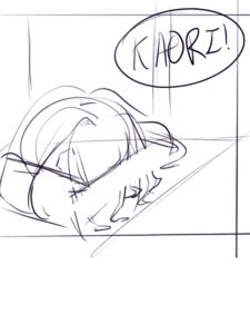
I have begun designing the plot for my work already and have created sketches of some scenes that I think will be more important. None of these are final and really serve only for me to get a better sense of how the plot feels so I can refine and change it. However, I think they are important to show a progression of the ideas I initially have, how I express them and what they end up looking like in the final version. Next week, I expect to draw a lot more of these sketches and to potentially start finalizing some panels or scenes.
To avoid confusion, the temporary names I have given the characters are, Nagumo Kaori for the shorter haired one, and Ito Shizu for the long haired one (in last name first name order).
Now here are some sketches, theyre mostly just for planning so
Reader Interactions
Comments
Leave a Reply
You must be logged in to post a comment.
This looks great! I love the focus on typography. I think that’s something that manga (and comics in general) can really use in a way that normal literature cannot. I think it matters more than many people might think, and I love that you noticed it. I can’t wait to see the plot outline and also see more of this come together!
Hi Leo! As Ms. Silva said, I also appreciate that you pointed out the importance of typography. It reminded me of a Webtoon I read once where every character spoke in the default all-caps font, but one character, who was known for his chill personality, spoke in all lowercase. I think small details like that subconsciously affect how we experience the dialouge and how we see the characters, especially in a work without audio, as you mentioned.